


Exploring diffusion models
How does AI art actually get made?
Diffusion models, a machine-learning model architecture around since 2015, were recently discovered to be exceptionally good at generating meaningful images. One of 2022’s many deeply exciting developments in artificial intelligence research, the rise of these models has given us the weird new ability to summon images from the collective unconscious.
Dall E 2 was probably the first of these releases to receive major public attention. However, the open-source ecosystem around Stable Diffusion models, the first of which was released in August 2022, is where truly exciting progress is visible. I’ve been exploring some of these tools and am very excited about what is being built.
One of the tools I’ve used is a technique called textual inversion, which is an implementation of the research published in this paper (project page). The technique can be used to capture some essence shared between a batch of images, whether that be a shared subject matter, mood or artistic style. In the case of my experiments, these were a selection of my drawings. The process records the details of what it worked out the batch of images had in common.
The aim of this article is to explain how this is possible in an easy-to-understand, intuitive way. I don’t have a technical background, but have been inspired by how groundbreaking this technology is to try to understand it at a deeper level. My own experience has been that the truly fascinating stuff is out of reach without a familiarity with machine learning. I hope to share with you an appreciation of how these models map out our visual universe in a way that lets us navigate our own imaginations via language.
What is textual inversion?
The way that Stable Diffusion is typically used is that we give it a text description of what we want to see, which it then translates into imagery. The first step in that process is that the text description is converted into a set of numbers that the machine learning model can use. These numbers represent the meaning expressed by our text description. Because of how these models have been built, these same numbers also represent the images that the models make. When you put the same numbers in, you will get the same images out. These numbers are called embeddings.
When we use the textual inversion technique, it works out the embeddings that produce the visual concepts shared by the images we have given it. What a visual concept can be is quite broad. There are literal visual concepts like the colours, textures or shapes found in an image and there are more abstract visual concepts like what subject matter occurs in an image. The concept “dogs”, though quite a literal category at first glance, is made up of all sorts of different visual concepts, like having different shapes or different colours and textures. There are even more abstract visual concepts like the mood expressed by an image or the historical connotations of a photograph’s colour palette and grain.
Now that we’ve used textual inversion to find the embeddings that capture the visual concepts shared between our images, we can assign it a pseudo-word that we throw in with the normal words we use to describe our images.
The meaning of our text description is changed by the inclusion of this pseudo-word. It has meaning in the same way that a word has meaning, except that this meaning is not something you could have expressed with any pre-existing word.
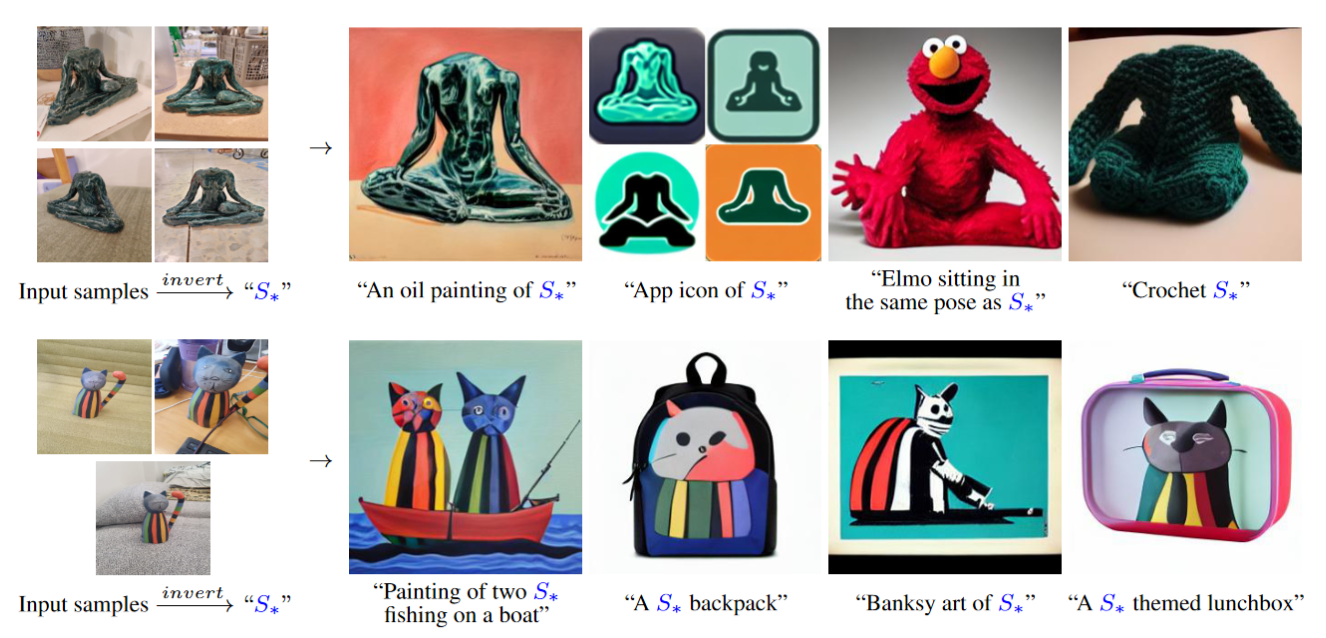
(Top: a statue. Bottom: a cat toy)
Illustration of what textual inversion does from the project page.
What’s going on in this graph?
The batches of images on the far left were used as training samples. The textual inversion process works out what these images have in common. The images on the right are examples of that concept being applied in new images.
Diffusion models
Diffusion models contain what you could describe as a map of potential images. This map is a projection of all of the possible images that the model could produce. So even though there is no map recorded in the model, the hypothetical images that the model can generate make up all of the points of the map. These points are grouped together by how similar they are.
The normal text descriptions we give SD to turn into images are converted into coordinates that the model uses to navigate to the part of the map that contains those types of images (I’ll go into more detail in the next section). The pseudo-text description created by the textual inversion process also works like this. This is what the name of this technique is referring to. The coordinates have been located first on the map and then transformed into their ‘text’ form.
What does the map look like?
The types of mapping that we are familiar with are usually 2D or 3D. A diffusion model’s map however is high-dimensional, so there are many more dimensions to move in than those familiar to us like East-West and up-down. I don’t know how many dimensions SD has, but it is probably many hundreds.
Despite being so complex and abstract, the map is tangible enough that we can actually explore it. When I used the textual inversion technique to copy my drawing style, it essentially located the “Sebastian’s drawing style” region on the map. But if you zoom out a bit, this region is itself located within a larger region that you could call the “similar to Sebastian’s drawing style” neighbourhood.
As you move further from the area that contains images most like my drawings, into the wider neighbourhood, the images that make up these further-flung areas will have less and less in common with my drawings. But consider how many ways an image can look more or less similar to another. There are versions of ‘less similar’ where the subject matter changes, versions where the medium used changes and versions where the mood the image evokes changes.
This is where having all those dimensions to move in comes in really handy!
* Another aspect of what these maps ‘look’ like is that these images are actually also ‘image islands in a sea of noise’. I find it difficult to visualise this at the same time as the overall map (which I just pretend is 3D), but they both work to describe what is going on. Stefano Giomo introduced this metaphor to describe this aspect of diffusion models in this excellent article.
Navigating latent space with textual inversion
One way of navigating this neighbourhood is to reduce the emphasis of the coordinates that we give it, so that they in effect widen. Another way would be to add a text description to combine with these coordinates, which will shift the coordinates towards the direction of the ideas that you have described with words.
I found this aspect of it super interesting. These further away images were often aesthetically quite different from my drawings, but clearly still carried some essence that it borrowed from them. They still looked like things that I would have made. Often these images contained visual elements that were very recognizable to me from experiments I had done in other mediums. It had never seen these experiments or anything close to them, but it seemed to be able to extrapolate from my work the kinds of other stuff I would do.
In a sense, the textual inversion process was able to see beyond just how my drawings look. It seems fair to me to describe what it saw as ‘meaning’. It recognized some degree of the meaning that I had communicated in my drawings. It saw something that exists inside my mind and which comes out in my work. But this isn’t something which I could just describe in words. This tool was able to record and then show me countless examples of other images expressing that same indescribable thing.
I’ll speculate a bit about what ‘meaning’ textual inversion is capturing, but to do so I first need to describe how meaning is mapped out in the world that this process operates in. This requires describing in more detail the diffusion models that create these worlds.
How does one even start to map out meaning?
The ability to map out meaning the way these models do is remarkable and didn’t arrive out of nowhere. A model like Stable Diffusion is built up of multiple smaller models, each previously developed by a research team and released for the world to further develop. Knowing a bit about where these models come from can help us understand how they recognize the semantic meaning contained in our images and text and how they map these semantics out.
Probably the most basic unit of meaning that these models find is the similarity between images. A similarity between two images can also be thought of as a category that those images can be grouped into. Image-classification (assigning images to categories) is a capability that has been completely revolutionised by machine learning in the last few years.
These earlier image-classification models that diffusion models were built on top of were trained to find the patterns that occur in how the pixels are arranged across millions of images. If the same pattern of pixels is helpful in understanding where an image fits into the wider world of images, it will be incorporated in the model’s feature-space. This is a map of all the features in the images it is training on. Each point on this map is a combination of features that together represent the qualities of an image. Points that share more features are nearer to each other.
Depending on the model, the lowest level of features to be picked up might be shape-edges, colour gradients or textures. These most basic features combined together will form more complex features. These could be patches of road or the stroke of a paintbrush, which when combined together to form even more complex features will eventually represent recognizable subject matter.
This map is shaped by the model’s objective: to predict the likelihood that an image falls into one of the categories that it knows. This is itself quite impressive, but to map out the very open-ended world of human imagery, every possible concept is going to need a category. This is where CLIP models come in.
Mapping meaning with Contrastive Language-Image Pre-Training (CLIP)
CLIP models overcome this limitation by using a different training method and a different source of image labels. A typical image-classification model will use a curated training dataset of a few million images, each image labelled with which category it falls under (usually out of 1000 categories). A CLIP model however will use a training dataset of hundreds of millions of images (or a few billion even) scraped from the internet.
These images of course won’t have been sorted into categories. Instead, they use as labels the image’s ‘alt-text’ captions. These text captions are typically included in image files to increase rankings in search engines and to enable screen-readers to read out the contents of images. They should describe the contents of an image, but the way they do this and the quality of the description will vary considerably.
In training, a typical image-classification model is given an image and tasked with predicting what the single category is that is in the image’s label. How well it predicts an image’s category is calculated as a score and given to the model to update itself with. It gradually becomes better at recognizing the categories it is being trained on.
A CLIP model is trained differently though. The graph below illustrates the ‘contrastive’ (the C in CLIP) learning approach that CLIP models use.
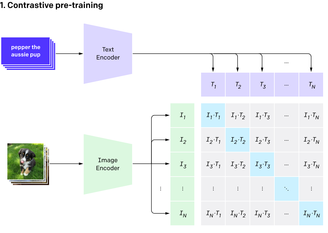
An illustrative graph of the Contrastive pre-training process from the OpenAI blog post announcing CLIP.
How to understand this graph:
- The Text Encoder and Image Encoder boxes are where the images and text get turned into numbers that the model can understand. I’ll explain more about this in a second.
- The lavender boxes labelled T1, T2, T3 etc are the alt-text descriptions of our images and the green boxes (I1, I2, I3 etc) are the images. So picture the lavender boxes as a row of text captions (eg. “pepper the aussie pup”). Picture the column of green boxes as a column of the images that the captions are describing.
- The blue boxes moving diagonally down the grid are where images overlap with their actual alt-text descriptions.
- The grey boxes that make up the rest of the grid are where the pairs of images and alt-text descriptions are mismatched. The captions in these boxes are describing another image instead.
I described in the last section how image-classification models map out all of the features that they find in the images they train on. The image encoders in this graph are mapping these features out. They work out which features are in an image and record it as a whole bunch of numbers. Because images are combinations of these features, these numbers are actually telling you where on this map of features you can find the combination of features that makes up a specific image.
So, a latent representation of an image is both a record of what features make up that image and a set of coordinates to where on the map of features you can find that image. The same is true of the text descriptions of our images. They also get turned into latent representations, which means they are also forming their own map of features, where their latent form (a bunch of numbers) acts as a set of coordinates.
Aligning two different latent spaces
So in these boxes we actually have latent representations of images and their alt-text captions rather than the images and text themselves. This means that we have the coordinates of where to find these images or texts on the map that is being constructed of all of their features. But these are coordinates to two separate maps. One is for text and one is for images.The way that CLIP models are trained provides an ingenious way of aligning these two maps at the same time as achieving its goal of being able to recognize virtually unlimited categories. The ‘shape’ of the numbers used to represent latent images and latent texts are deliberately the same, which means that you can use a set of latent image coordinates in the text map and vice versa. You can then work out the distance between the coordinates of an image and its text caption as though they were on the same map.
The distance between these coordinates can be used to create a score to give back to the model to update its algorithm. We want the correct image-text pairs (the blue boxes) to be closer together and the incorrect image-text pairs (grey boxes) to be further apart. A score is calculated that measures how close matching pairs are as well as how far apart mismatched pairs are. Over time, the model will simultaneously map out the features of these two latent spaces and align them together.
Both of these aspects of CLIP models seem quite incredible to me. On the one hand we have an incredibly fine-detailed map of how human imagery fits together, on which you can even find images expressing ideas that no human has ever thought of before. On the other hand we also have a text version of that map, which has tied the imagery of the first map to the meaning of our words. We can use our words to navigate the map of human imagery.
Unfortunately, at this stage these images exist only as hypothetical combinations of the features that make them up. We still need a way to manifest them into the type of images that we can actually see.
How do we make these hypothetical images visible?
Diffusion models make images a bit like how sculptors chip away at a block of marble until only the finished artwork remains. In the case of diffusion models this block of marble is an image of pure noise. The process of chipping away marble for a diffusion model is one of removing noise bit-by-bit until only the finished image remains. Just like the marble sculpture inside the marble block, there isn’t one specific image trapped underneath the pure noise. So how does a diffusion model find this trapped image that isn’t even there to be found?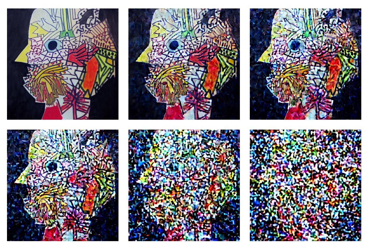
An image with progressively more noise added
A diffusion model has been trained on billions of images that have had varying amounts of noise added to them. Some images have had almost no noise added at all and some have so much noise added that no trace o
The way that noise is added to images during training means that you can also remove it. Instead of outright deleting the image underneath, it shifts the colour of that spot of the image. Once our model has predicted what of the image is noise, we can subtract that noise from the image thereby shifting that bit of the image a bit closer to how it was originally.
It’s quite an ask to predict an entire image at once, based on just a square image of pure noise. But because the model was trained on images with so many different amounts of noise added, it’s really good at predicting a bit of noise each time it tries. One step at a time it can gradually remove all of the noise and leave only an underlying image.
But how well can it really determine what is in a never-seen-before image after being shown a few scraps of it? And what about when there is no trace of an original image at all? If there aren’t any patterns, but it’s so good at finding patterns that it finds them anyway, what does this imply? If it’s settling on the closest thing it can find to a pattern, then isn’t it more just projecting its own biases? At this point it’s just hallucinating imagery.
The model is hallucinating, now what?
So how do we guide this hallucination to underlying images that we want to see? The way this is done happens during the training process. A detail that I left out is that the model isn’t just given noisy images. It is also given a hint. The hint that it is given is the latent space coordinates of the image in the CLIP model from earlier.
Most of the data that it uses to train itself to predict noise is from the images themselves. Images have a lot of info. But these latent space coordinates are also pretty nifty. Though the model could probably learn to predict the noise quite well on just images, this added hint is what allows us to shape the image-generation abilities to the latent spaces that we built earlier. The benefit of this is that not only did the CLIP model do a good job of mapping out human imagery, but it also lets us easily navigate this imagery by aligning the latent space of images with the latent space of text descriptions.
Now when we ask the model to generate images, we simply need to give it the same kind of hint that helped it when it was training. We need to give it a description of what we want to see. This text description gets encoded into its latent form, which (because of how the CLIP model was trained) is also the coordinates to where in its latent space of images you’ll find the images that express that same semantic meaning.
The model starts with an image of pure noise and our hint. It uses our hint to guide its denoising process as it gradually reveals the underlying image*. We are now able to extract images from this map of hypothetical images.
* It actually even goes a bit further than this. During the denoising process, the info that it gets from the noisy image is so much more helpful than the text description hint we give it (there’s way more data in an image). So what it does to compensate is as though it drew a line on the map between what the final image would look like with no hint and what the image would look like with a hint. Then it continues further along the line away from the no-hint image. This nifty trick effectively multiplies the guidance that it receives from the hint, giving the text hint more of a say of how the final image will look.
Quick summary
- When we give Stable Diffusion a text description of what we want to see, this text is encoded into a latent form. This form is recorded as a bunch of numbers.
- This latent text locates the description’s semantic meaning within a high-dimensional map of text features. These features were mapped out by the CLIP model according to how we use text to describe images.
- The latent text can also be used to locate the same semantic meaning expressed visually in a map of visual features.
- The denoising part of the model, which generates the images, was given these coordinates as a hint when it was trained to denoise images.
- Because the generation process has now learned to associate the images it generates with their latent coordinates, we now have a way of manifesting these latent meanings into their pixel forms which we can see.
What is the map actually made of?
One last technical bit before we get back to the art stuff!I’ve been describing these models as containing a map of potential images. But there aren’t actually any maps recorded inside the models - the map is implied by the possible outputs of a model. Every input we give Stable Diffusion has one output, which is one point on this hypothetical map. The map is an extension of all of the possible outputs of the model. Possible outputs are grouped by similarity - the more features possible images have in common the closer to each other they will be located.
So what’s a more literal way of thinking about these models? In a more literal sense, the most basic building blocks of machine learning models are their hundreds of millions of parameters. A parameter is simply a straightforward calculation that gets applied to any numbers that pass through it. A parameter’s job is to take a number that is given to it, apply the single formula that it knows and pass on the resulting number to the next parameters.
As we saw earlier, the text encoder turns the text descriptions that we give to Stable Diffusion into a bunch of numbers. These numbers work their way from the one end of the model to the other to the other, being transformed by the calculation of every parameter along the way. At the end of their journey they are decoded back into a (visual) image by the image decoder.
There’s only one place where we can input our text and there’s only one place for the resulting image to come out. Also, the parameters only change during training, so every possible output has already been baked into the model. This is quite different from other software where any necessary information can be conveniently stored in different formats, in separate files and be accessed only when needed.
So how does something so inflexible come to map out all this imagery? The key is in how these parameters are changed during training. The changes that are made to these models in training are happening at the level of weights and biases. Weights refer to the connections between parameters. They control how much the number being passed on is amplified or suppressed. A bias is a number inside the parameter that is added to the end of the calculation.
Eg. If a weight is set to zero then the number passing through it on to the next parameter will be zero, as its signal has been entirely suppressed. This will lead to the parameter’s formula calculating zero except for the bias that gets added at the end. In this case only the bias remains to be handed on to the next parameters.
When a model is first trained these weights and biases will all be random. Any input you give will have a meaningless output. But you can calculate a score of how well this meaningless output did compared to the output you want it to have. It’s going to have achieved a really, really bad score. But then the model can make changes to its weights and biases and it will get a different terrible score. From there it can start working out which changes improve its score and which changes make it worse. Over time it will hopefully get better and better.
Because these models are trained on potentially billions of images, the changes they make need to find an equilibrium between being able to generate all of the types of images in its training dataset. If it adjusts its weights and biases to be able to reproduce one image too much, it will hurt its ability to reproduce all others.
So to bring this back to the idea of maps of imagery, this map is a hypothetical expression of this equilibrium that the model settled on over the course of its training. The map is implicit in the weights and biases of all of these hundreds of millions of parameters.
Speculation!
I can’t help but wonder what it is exactly that the textual inversion process recognizes in my drawings. Perhaps it just did a really good job of working out the ‘visual stuff’ that makes up a drawing. This could be the shapes, colours, thickness of lines and that sort of thing. This framing would suggest that the model has the rudimentary cognitive abilities needed to recognize these obvious visual features, but not really much more than that.
It can then make new images by jumbling up these visual features in a way that still follows the rules that it picked up in my drawings. But, where do you draw the line between an actual visual feature and a rule? It seems somewhat arbitrary that once the most minute features of an image are combined in a pattern complex enough that we decided that tjat they no longer count as features, but are now rather the ‘rules’ that these features follow.
I suspect that this mostly reflects the level of detail that we default to when looking at images. But fair enough, surely the images that the models were trained on also reflect this bias to some degree. The model is of course shaped by the choices that we make when we create and then upload images to the internet.
But I just don’t think there is a categorical difference between the rules that govern how the features of an image combine and the features themselves. I also don’t think there is a categorical difference between the rules that govern what makes an image of a cat and what makes an image that expresses ‘chilled vibes’. Sure, images of cats might be clustered on these maps in very different ways to how images expressing ‘chilled vibes’ are, but these concepts are still just areas on these maps.
The implication of this for me is that it is mistaken to think of textual inversion as simply mimicking the visual stuff of my drawings. I think of it as mimicking every possible type of meaning that it can pick up in my drawings. I see it as determining how the visual language that I use in my drawings relates to how all other imagery looks and also to what it means in the context of what all other imagery means to us.
The connections between images that resemble my drawings and all other images were already mapped out long before I used the textual inversion to find these connections. These images are both the locations that plot out the map as well as hypothetical combinations of all of the features that connect them as locations. The features can be anything from quite literal to highly abstract, from ‘brown cat’ to ‘sorta chilled vibes’.
I think that this is utterly remarkable, if only quite limited in how well it does this. I assume that the model is better at defining images with literal descriptions because the alt-text captions used to train it were most likely literal descriptions. Textual inversion fits into the picture here by giving us a way of navigating these images that doesn’t rely on language, which is rumoured to have its limits.
Final thoughts
As a teenager I spent a lot of time dialled-up to the internet on my family’s computer, looking for cool images that captured my imagination. I would print some of them out and stick them up on my wall alongside doodles I’d drawn. Later in life I became obsessed with finding cool images (mostly art) on tumblr, curating several visual journals with hundreds and hundreds of images that seemed to really get it.
When I use Stable Diffusion it feels a lot more like that aspect of my artistic journey than actually drawing. I feel as though I’m exploring imagery rather than creating it. I’m not sure where this incredible new capability leads. How much time would I have spent looking at other people’s images rather than finding new ones in these visual universes? What will tumblr and instagram look like when artists start to use these tools to explore less obvious aesthetics?
Recommend resources
Tools:
If you’d like to try out diffusion models, the easiest way would be to use Dreamstudio. You could also use Dall E 2, which in my experience is better at creating some things, like photographs, but not as good at making art. It is more expensive though. You won’t get these incredible tools though with either option. At least for the time being.
I made all of the above images with the Stable Diffusion v1.5 model on the AUTOMATIC1111 build. If you want to download and run Stable Diffusion on your own computer, follow that link. You will need a somewhat decent graphics card though. There’s also a link on that page to run Stable Diffusion on Colab, Google’s machine-learning platform.
Explainer article with loads of graphs:
Jay Alammar’s Illustrated Stable Diffusion is a really great overview of how Stable Diffusion works. It’s a bit technical, but I think that having read my article you should be able to make sense of it. This is where I got the idea for the title. “Departure to Latent Space” is how the authors of the original latent diffusion paper described the concept of performing the diffusion process in latent space rather than in pixel space.
Online courses (the best resource for a deeper understanding):
Lesson 9: Deep Learning Foundations to Stable Diffusion
This is without a doubt the best deep dive available to understand how Stable Diffusion works. It’s technical, but Jeremy Howard has an incredible knack for explaining difficult ideas in an easily understandable way.
Fast.ai’s entire Practical Deep Learning for Coders is likewise the best possible deep-dive intro for anybody wanting to understand how to create AI tools. You will need a basic understanding of Python to do this course, but if you haven’t ever coded before I wouldn’t let that stop you! Find some online Python intro resources and you’ll quickly get to the point where you can more or less follow on. The first few lessons were my first tinkerings with code and I had a lot of fun.
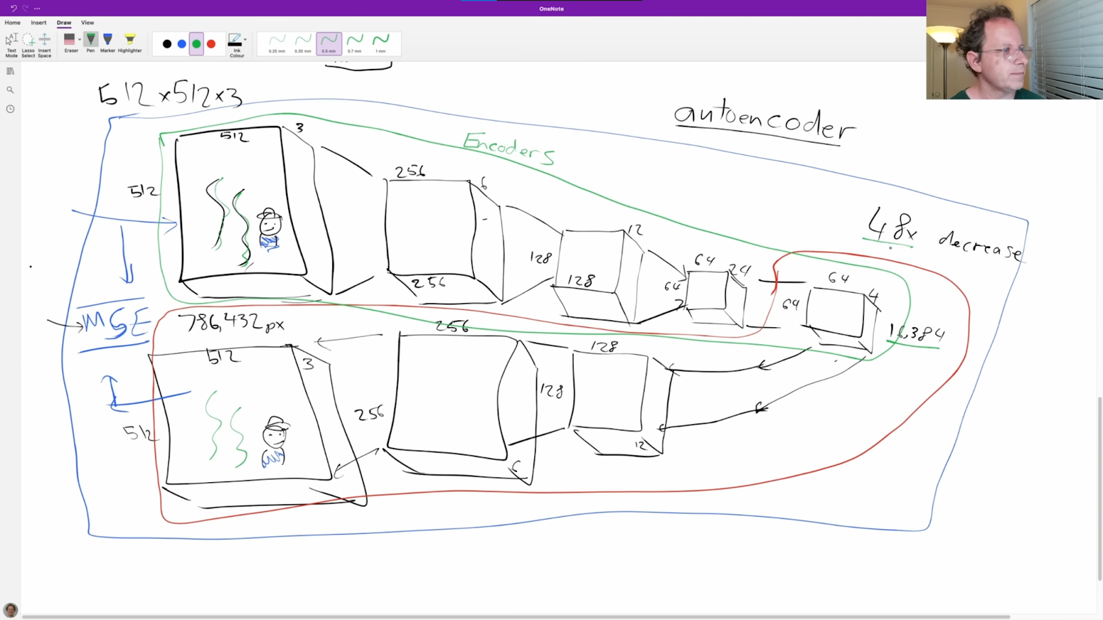
Jeremy explaining Stable Diffusion’s autoencoder.
Lesson 9A Stable Diffusion Deep Dive:
This bonus lesson by guest lecturer Johnothan Whitaker is a fantastic even-deeper dive into how Stable Diffusion works. I highly recommend it, but you will need a basic Python understanding here! Jonathan also has his own epic course, The Generative Landscape, going deep into how to use these models to make art.

Jonathan explaining the ‘manifold of real images’, which is the concept behind the ‘real image islands’ metaphor.